

Start With A Feeling
Start With A Feeling
A deep-dive into how I made the artwork for my debut album.

Hey!
Hows your week been going?
Today I wanted to share the journey I went on to make the artwork for Typical Forever, my debut album. My album about geology. 99% of you know already what I’m talking about, but there’s also been some new subscribers this week!
This post is ‘too long for email,’ apparently, so if you want to read it in full, just click the ‘view in browser’ at the top of this email.
I also have a tiny update about my Kickstarter for the album… WE REACHED £4000 AND 100 BACKERS!! AAAh!!
There’s still 5 days to go. Can my mind possibly be even more blown? Is £5000 within our grasp?

I’ve made my own artwork for all my releases so far, and I knew that I wanted to continue that trend. For me, being a musician also means being a creative director and visual artist. It’s so fun to get to do all the things!
Despite the process being fun, the album artwork for Typical Forever didn't come so easily.
Here’s how it went.
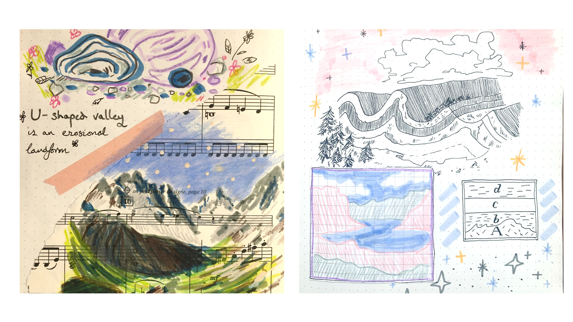
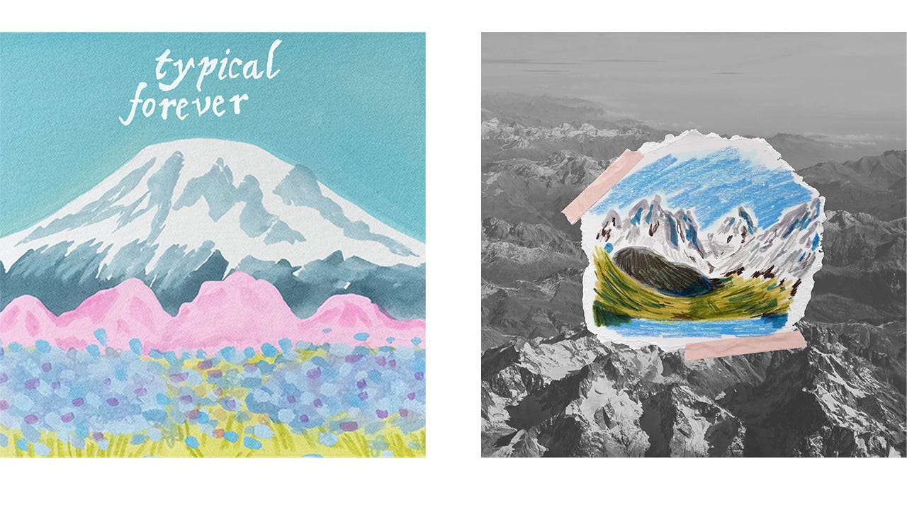
As I was learning about geology through Nick Zentner’s lectures on Youtube, I was also doing little doodles and collages like the images above. At this point I hadn’t started dreaming up an album yet.
When I did start writing songs and thinking about creative direction for an album, I ended up coming back to these two images in particular, as they had a ✨ yay geology! ✨ energy to them which I liked. I wanted to keep that energy as the album’s visual identity.
⛈️ Brainstorming
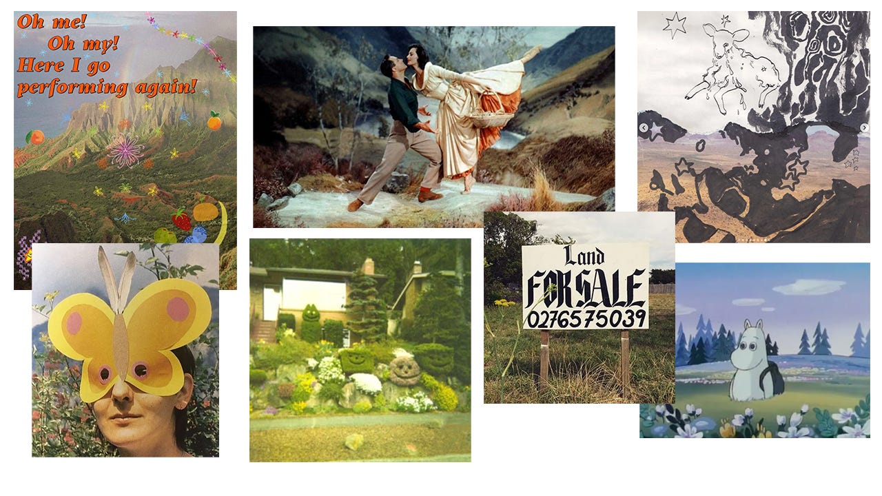
As the album was coming together more and more, I started to make Pinterest boards and collect ideas for the creative direction. I think at this point I’d written all the songs but the album didn’t have a title yet, and nothing had been recorded.
Here's a list I wrote of things I wanted to invoke:
medieval manuscripts✴︎ tapestry samplers ✴︎ blue, pink, green, yellow ✴︎ smiley faces ✴︎ playfulness ✴︎ toy-like ✴︎ real and fake landscapes ✴︎ chess ✴︎ tiny villages ✴︎ miniature villages ✴︎ stained glass ✴︎ folk art from UK and Europe ✴︎ folk costume from UK and Europe — Eastern Europe ✴︎ icons, like computer icons ✴︎ rainbows ✴︎ fake scenes, dioramas ✴︎ gothic lettering contrasting lots of colour and simplicity ✴︎ layered settings like a theatre stage ✴︎ Moomin valley ✴︎ maps ✴︎ Polly Pocket houses✴︎ Mary Blair, It’s a Small World✴︎ high fantasy
As you can see, I wanted something that was going to communicate fun. For me, geology is this world of imagination and stories, and I wanted people to instantly identify this sense of wonder and imagination when they saw any visuals linked to the project. I wanted to make it like Disney… for geology. But with less Mickey Mouse (more like mica mohs!??? ha! geddit? no? don’t blame you it was a terrible pun).
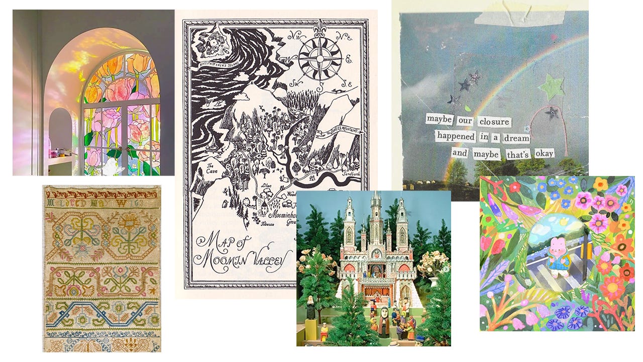
I made some moodboards:
As I let these visuals stew in my mind, the title for the album came to me:
✨ Typical Forever ✨
It’s a phrase that I read in a book called Hutton’s Arse, by Malcom Rider. It goes as follows:
“what we see around us is typical forever and we can expect no difference from the past”
It’s basically a take on Charles Lyell’s Uniformity Principle, which is the basis of modern geology. It’s the idea that the world has always abided by the same physics and rules, so the way that mountains are built and broken down today will be the same as it was 3 billion years ago.
It’s a nice thought, typical forever. I had an idea of these words in gothic typeface, hovering over a mountain. So I made a crude image with DALLE AI, the prompt was something like, “35mm photograph of a diorama of Mount Rainier.” I then downloaded a free, gothic, Disney-esque font, and created this:
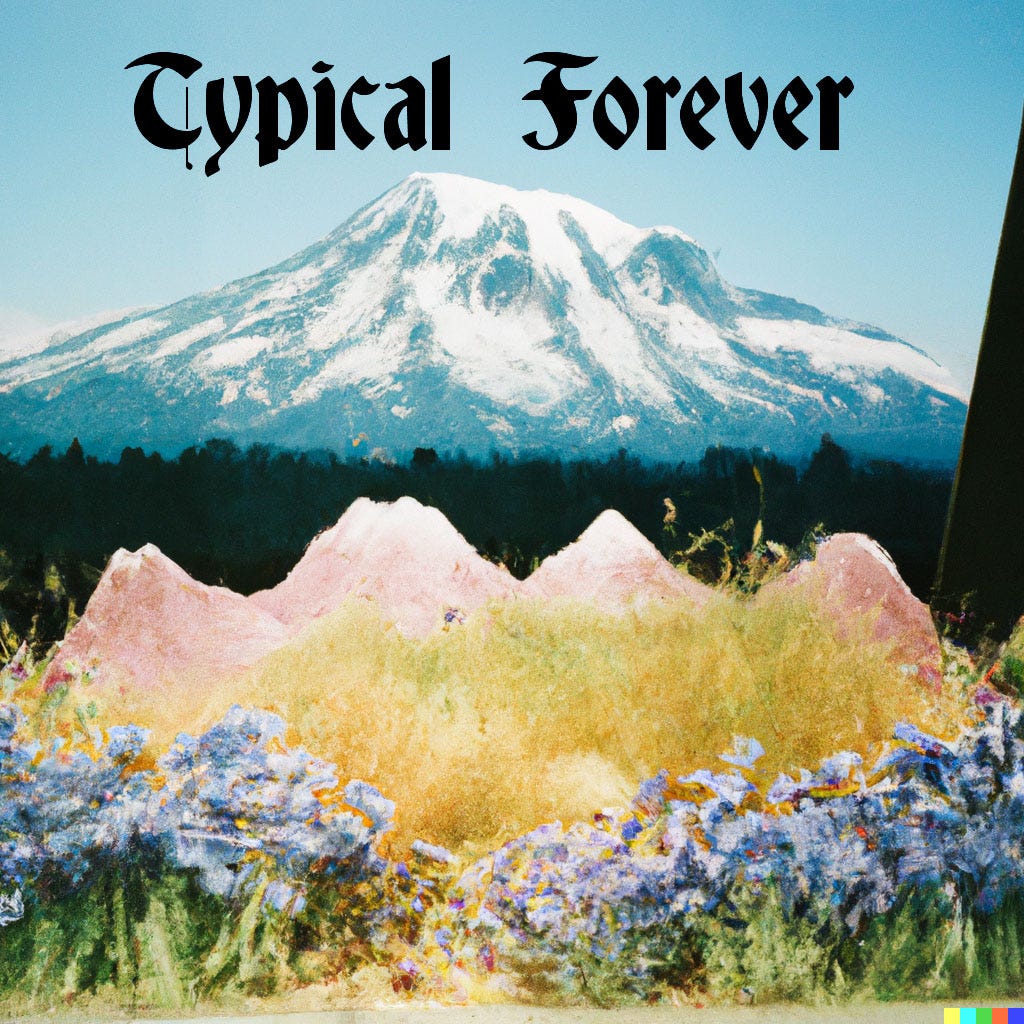
This wasn’t going to be the final artwork, but it gave me something to add to the moodboard.
A quick aside about AI: I swither on it as a form of creating images. I don’t want it to straight-up replace our need for artists, and I truly hate seeing articles which begin with a big glossy image which you can instantly identify as a product of Midjourney or a similar program. I like AI as a collaborator, like in the instance above. I like it as a thing you can present some half-formed ideas to, and then ask what do you think? It’s not an end, or even a means to an end, but a part of the inspiration process.
has a great post on this, and I love how she incorporates it:
AI when it comes to music? Different story. Although that Peewee Polka Dotted Pig song has got stuck in my head recently.
🎨 First Attempts
So… what do you do when you’re trying to come up with original album artwork? Start with what you have, open Photoshop and just mash things together.
I knew that I wanted one thing on the album cover, for sure: mountains.
Mountains summed up a lot of what the album is about, directly or indirectly. Geology made me realise that mountains, despite seeming like these ever-present gods of endless time, are finite creatures. If you zoom out by a few hundred million years, mountains are born, and they can grow. They can erode and wither away, be buried by oceans and floods, they can crumble into sediment and float away on the wind, and… they can explode!
Mountains feel permanent, but they’re temporary, and they’ll change forever.
Just like life, really.
I had this photograph of the French Alps which I took from an airplane window back in 2016. I used this as my starting point, turning it black and white and playing with it as a background, adding a hand-painted title:

Part of me at this point was like, “Nice! I have completed my goal. Now to sit down and drink a piña colada.”
Alas.
As enticing as the first draft is, you’ve got to push harder. So I kept going and tried other things, too. I drew the mountains by hand:
The image on the left was my attempt at making the AI-generated image I made earlier. Very… meh. After making the image on the right, I thought I had maybe cracked it.
Here’s one thing about the creative process: at every turn, you will try to convince yourself that the job is done. You will But the job is NOT DONE! You have to really put your whole ass into it before you can sit back and congratulate yourself.
At this point, I took a break from drafting artwork and told myself that I would come back to it later. I had other things to sort out with the album, namely, getting the music finished. I had mixing to do, mastering to organise, and I also had to find some more money to actually cover the album release.
👊 Back With A Vengeance
A couple of months ago I knew I had to get the artwork sorted out, and sorted out SOON. So I decided to get physical and create something on paper, instead of drafting on Photoshop.
This was what I really wanted, anyway: something with paper and glue and sequinned stars. I’ve always loved doing collages in my journals and I knew that this was a big part of my visual identity as an artist online.
My Dad likes to take photos of landscapes on his travels around Scotland, and I really loved this one of Stac Pollaidh, a formidable mountain in the North West Highlands, made of Torridonian sandstone. So I printed it out at work, the only place I have access to a printer, and put it in a sketchbook to play with.
I tore the photo into a rough square, painted a crude rainbow over it with POSCA markers, felt pens and pencils, I tore up extra bits of mountain to give it more of a collage feeling, stuck some sequin stars and washi tape down and ended up with this:
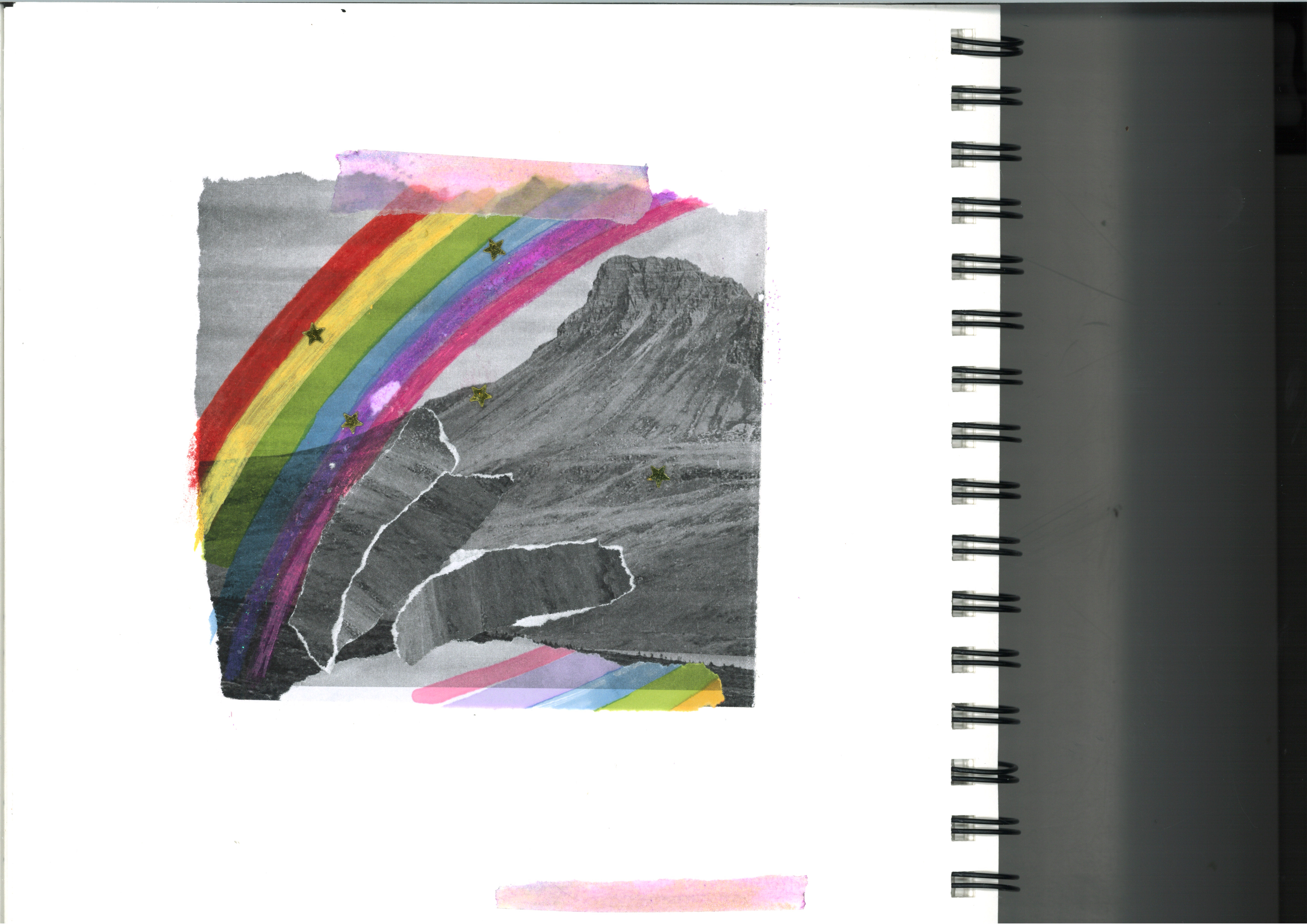
I liked it. I knew this was something.
Now, how to do the title?
It feels like it shouldn’t be that big of a deal, but the look of an album title is a big deal. A lot of albums these days don’t even feature a title or the artist’s name on the artwork, but as an unknown musician, it’s something you can’t really afford to forgo.
I wrote ‘typical forever’ on a piece of paper, and cut it up, placing it over my collage:

It sucked. Man, why did it suck so much? My handwriting was too at-odds with the image.
I tried various fonts on the computer, before eventually finding something which felt mythical, yet legible. A book-y type of font.
Voila:

Now we’re talking.
I knew at this point that I’d arrived. And I was glad I didn’t just slump down and settle for idea number one. It had the mountain, but it also had that streak of magic: a hand-drawn, glittery rainbow scoring the face of Stac Pollaidh. The black and white mountain represents time, tradition, science, age, seriousness… whereas the rainbow represents play, joy, wonder and, well… me, I guess?
To quote Hannah Montana, you’ve got the best of both worlds. Those worlds being me, and geology.
No, Hannah Montana didn’t say that last part.

🎙 Upcoming Gigs
London! I’m playing soon, and it’s free:
London, 23rd May: Bright Nights @ The Foundry Space, Walthamstow | FREE ENTRY
Check out some ways you can support me & my music:
listening to my music on Spotify (or not, if you’ve read my last newsletter)
forwarding this newsletter to a friend!
and if you haven’t already, subscribe:
Til next time! Be good,
Olivia 🌈✨🏔🎶
Such a beautiful cover!!!!!
Phenomenal cover. Love it. Wish I had an ounce of your artistic talent!