Howdy folks!
It’s a beautiful Thursday, the wind is blowing in the trees, and I am thinking listening to my usual 10-hour Animal Crossing music playlists (it helps me get into work mode). Later today I am going to start doing some work on the recordings we got from the studio! But more on that later… for now, I need your eyes.
If the menacing subject line of this email has eluded your comprehension… I’d like to clarify.
I want your opinion on something! Yes, you!
I have entered the PROTOTYPE ZONE when it comes to making the album artwork, and it’s always really handy to see what people like/dislike at this stage.
Here’s a few images that I’ve been using as inspiration:
What I want to evoke is something playful and fun. I also really like the contrast of black and white against pops of colour. In terms of colours, I like pinks, blues and greens (like the colour scheme of this newsletter), and I’m interested in hand-drawn elements. I would love to make it feel like a collage, but quite a simple and striking one. I like the juxtaposition of scribbly drawings with photographs.
So, here are some rough ideas. None of them are final and I will probably try some more varied ideas soon, but I just want to see what resonates with you.
Here are some questions for you (feel free to answer some, all, or just one):
Which of these album covers jumps out at you the most?
Which one do you feel is the least captivating?
What do you think is missing?
If you could mashup different parts of two different covers, what would you choose to combine?
Is there an idea or an aspect in these covers that you really like and think I can go bigger/better on?
I would absolutely love it if you left a comment below, or even sent me a quick email back with your opinion. I know a lot of artists read this newsletters, and also people who have excellent taste! Even if you think your opinion may not matter, it does to me. Awwwww. So go on and share what you think!
things i liked (bug themed)
✶ Completely unintentionally, most of the stuff I want to share today is insect-themed. We have discovered a lovely stag beetle who is based in my back garden at the moment. Her name is Beetleborg and she slowly walks around and kind of falls over, sometimes. We’re not sure what else she’s up to but it’s nice to come home and check the garden and see Beetleborg, living her best life. Long may she reign.
✶ Speaking of stag beetles, this is brilliant:
✶ We then migrated on to watching videos of this man whose sole purpose is to find bugs and get bitten or stung by them? A hero we didn’t want, we didn’t need, and who should probably quit while he’s ahead (see: alive).
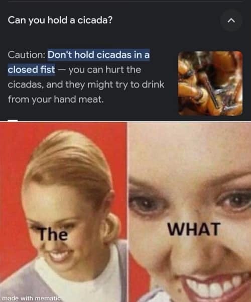
✶ Cicadas drink what?
✶ Ok, non-bug things. I’ve been enjoying this Georgian song:
Thanks for lending me your eyes! You can have them back now. Go forth and protect your hand meat from cicadas (see above), and have a good week.
You can support this project directly by taking a minute to do one of these things:
buying a ‘Gneiss Guy’ tote bag on my Bandcamp
listening to my music on Spotify and adding it to your playlists
forwarding this newsletter to a friend!
and if you haven’t already, subscribe:
Til next time! Be good,
Olivia 🌈✨🏔🎶


I have some album cover thoughts! 2 is my favorite; it feels like a portal and draws my eyes in, it’s got dimension, and I dig the collage vibe—the tape on the edges is a nice touch, and I think you could easily add a title to it à la 4. The hand drawn-looking title reads well over a photo for me.
1 feels the flattest to me and doesn’t have the same collage energy as the rest. It could do with some sort of black and white element or background like 2. I also like 3, but the greyscale/color combo of 2 takes it up a notch higher for me.
PS: Keeping my hand meat away from any and all cicadas.
I keep changing my mind about the album covers! I like all of them for different reasons. Is the mountain in #1 Mt St Helens or am I just projecting because it's my favorite mountain (volcano!)? The contrast between black and white and color in #2 really appeals to me. I think #2 but with the title from #4 would be my choice. But I really like the little mountain drawing from #3 too!